Ivan Polysaev Redesigns the Identity for Sobaka Magazine.
“Sobaka” is the first local glossy magazine about the life of St. Petersburg, which has been published monthly since 1999 and writes about the city, fashion, food, entertainment, beauty, health, social life and much more. In my opinion, today the magazine does not have a recognizable and systematized single corporate style that would show the status, freshness, youth, trend-following and authority of a popular multi-page publication in Russia.
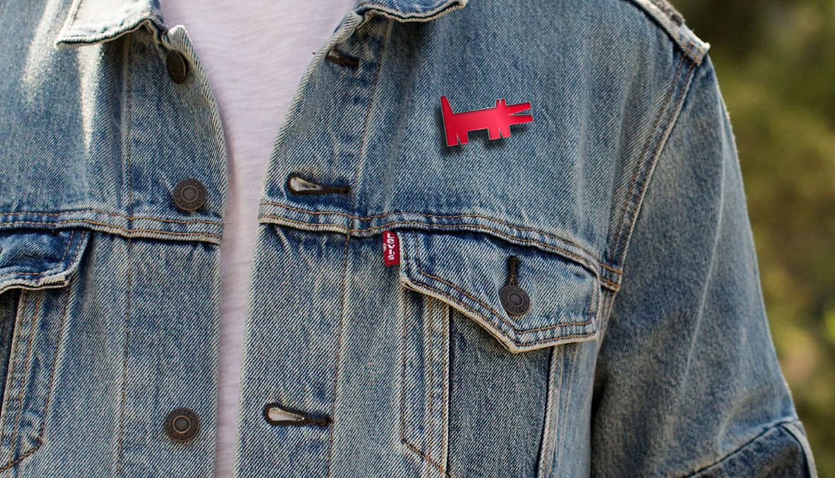
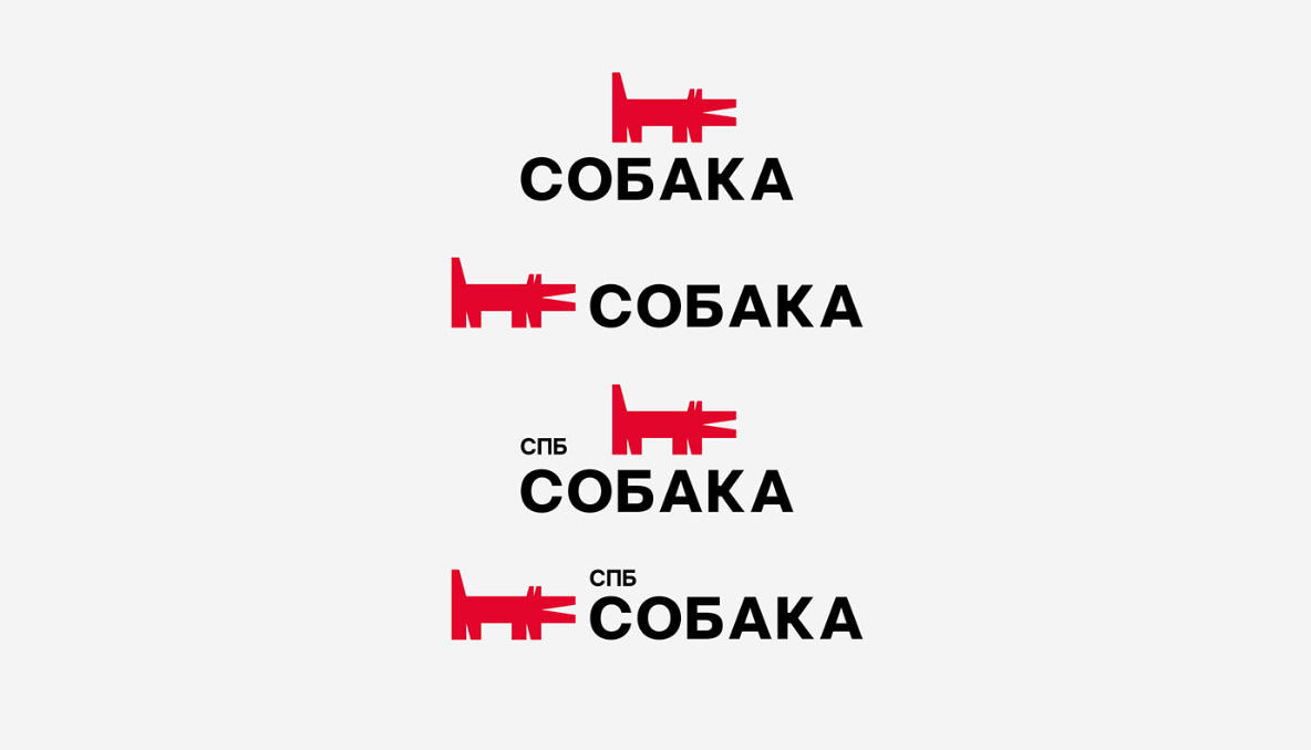
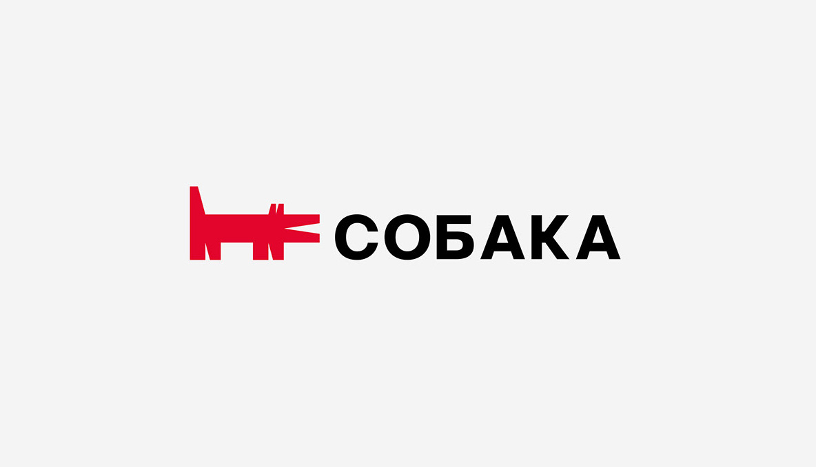
The new updated logo has gotten rid of the overabundance of small details: black outline; points forming the image of eyes; details on the dog’s body. The logo became geometric, minimalistic and modern. Now the proportions of the logo correspond to the golden ratio, which makes it visually proportional and aesthetic. I’ve updated the logo color. The updated red has become more saturated. It conveys the energy, activity and audacity of creative St. Petersburg.
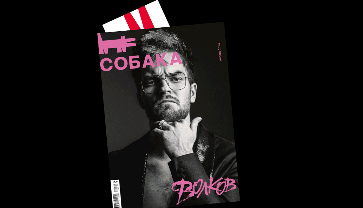
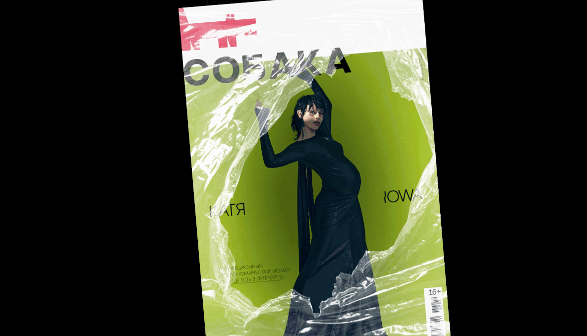
In addition to the logo, the structure of the magazine’s name was updated. The following have disappeared from the main version: the postscript “RU”; tagline; abbreviated name of the city – this was information noise. I also updated the title font and moved away from over-engineered display letters to clearer, clearer and simpler grotesque style.
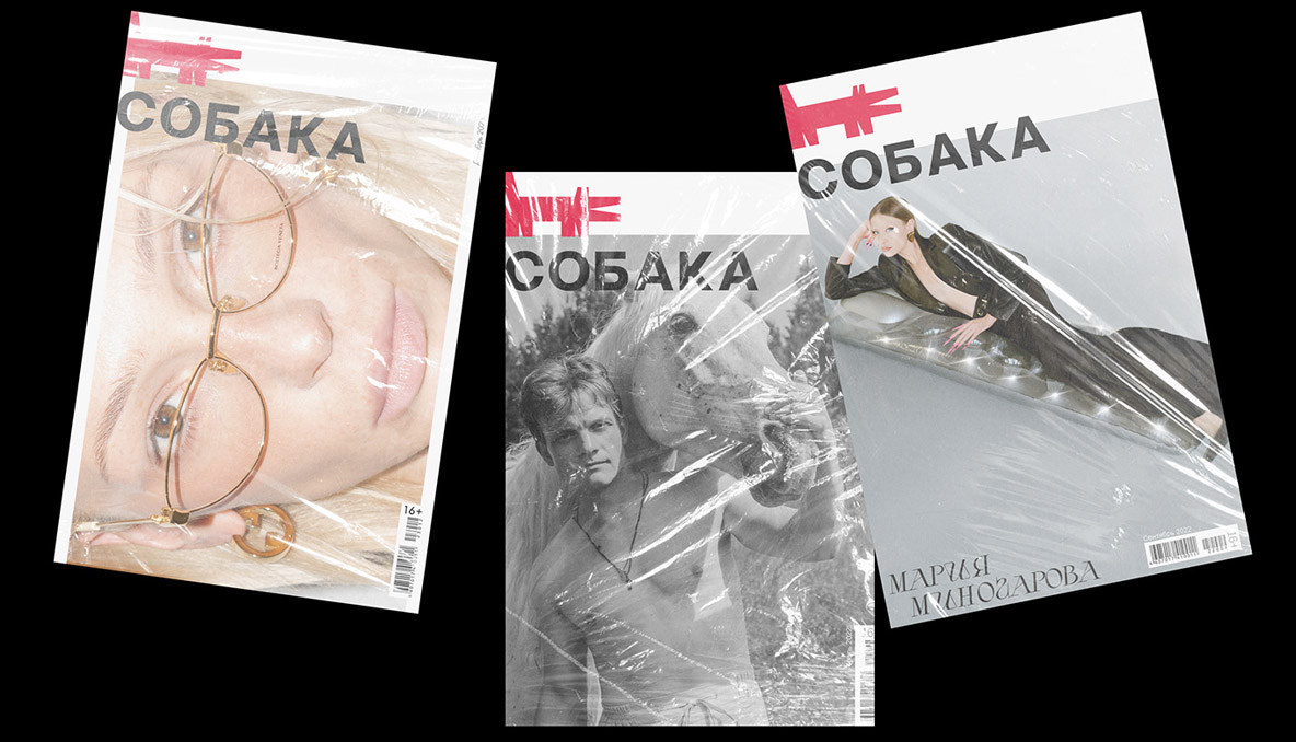
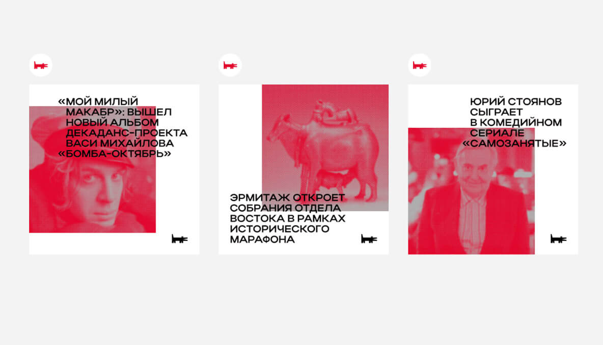
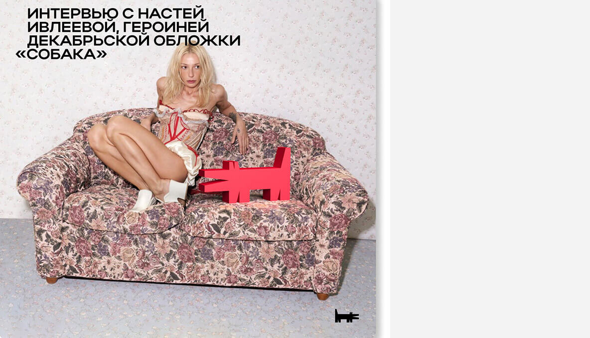
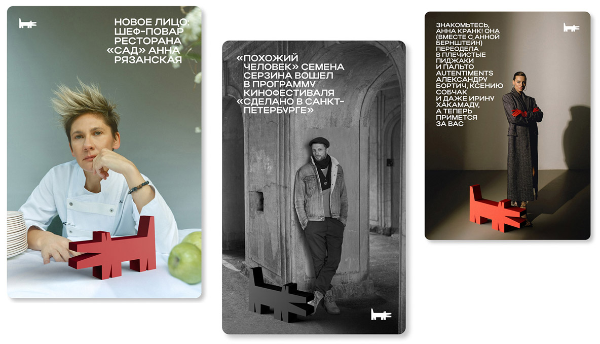
The new identity now uses retouched photographs, which are tinted in an updated red color, or in addition can be with a “bitmap” effect. Photos can also be used with a gradient effect from the corporate color. Photographs can exist freely in the composition, be in a container in the form of a logo, or be located along the edges of the media, thereby referring us to the multifaceted St. Petersburg.
Full case on Behance